

USC Mobile Order
Doubling college students' efficiency in ordering food
Timeframe
3 weeks
Role
UX Designer
Team
Explored a redesign of the campus food ordering app
Tools
Figma
Zoom
Zoom
Overview
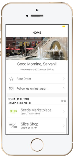
The campus food ordering app was failing students with its clunky interface and confusing wayfinding
“One time, it told me I had an hour-wait time [to pick up my food], but when I checked 20 minutes later, it said it’d been ready 15 minutes ago. It was cold and gross by the time I got there.”
Hangry student interviewee
“I didn’t even know some restaurants existed until I was off the meal plan! I only found out about the law school salmon bowls by the end of my freshman year.”
disgruntled college senior
skip to the solution

research
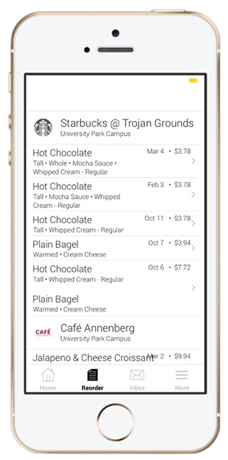
Students abandoned the app midway through ordering 20% of the time because of its confusing and info-dense interface
I asked student interviewees questions to understand the app's pain points. Here are some examples of the questions I asked, allowing them to be open-ended to allow for more organic input from the user.
I then used affinity mapping to make sense of the feedback.
I then used affinity mapping to make sense of the feedback.
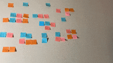
I condensed 90+ data points into concise insights that i could use to drive my ideation
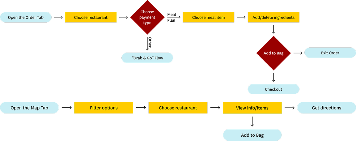
flow
I mapped visual heavy, spatially driven features that I could realistically build in the timeframe
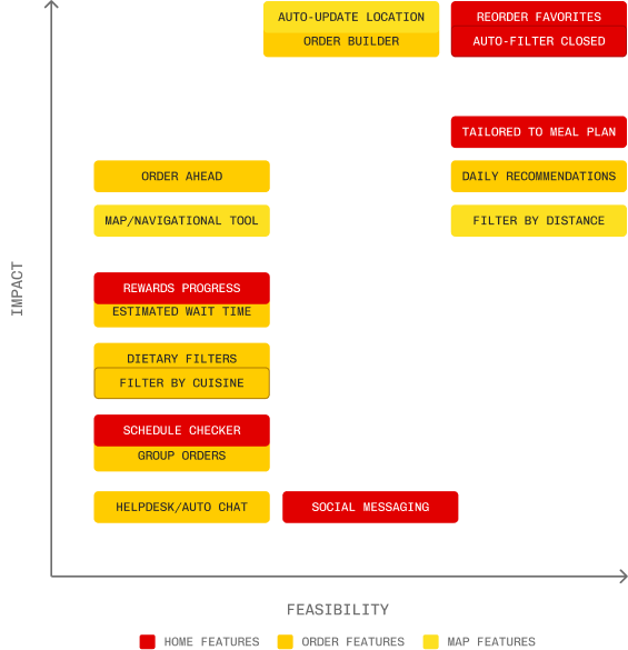
I pinpointed which features (out of the ones I had brainstormed) would be both feasible within the constraints as well as have a deep impact on my end-users.
I realized simpler tweaks like 'reordering favorites' would have to balance more ambitious proposed UX changes, like an 'order builder'.
I realized simpler tweaks like 'reordering favorites' would have to balance more ambitious proposed UX changes, like an 'order builder'.
Design Process
In my design, I balanced aligning with the college's brand identity with modernizing the overall experience of the app
While I undertook a sweeping overhaul of the visual interface, I tried to stay true to those features that students said worked for them and the lessons I had learned from a competitive audit early in the process.
I had previous experience designing digital assets for the college’s social media platform. I used this knowledge of the design system to my advantage when putting together the component library.

Design iterations for the homepage, each tile went through further iterations not pictured here
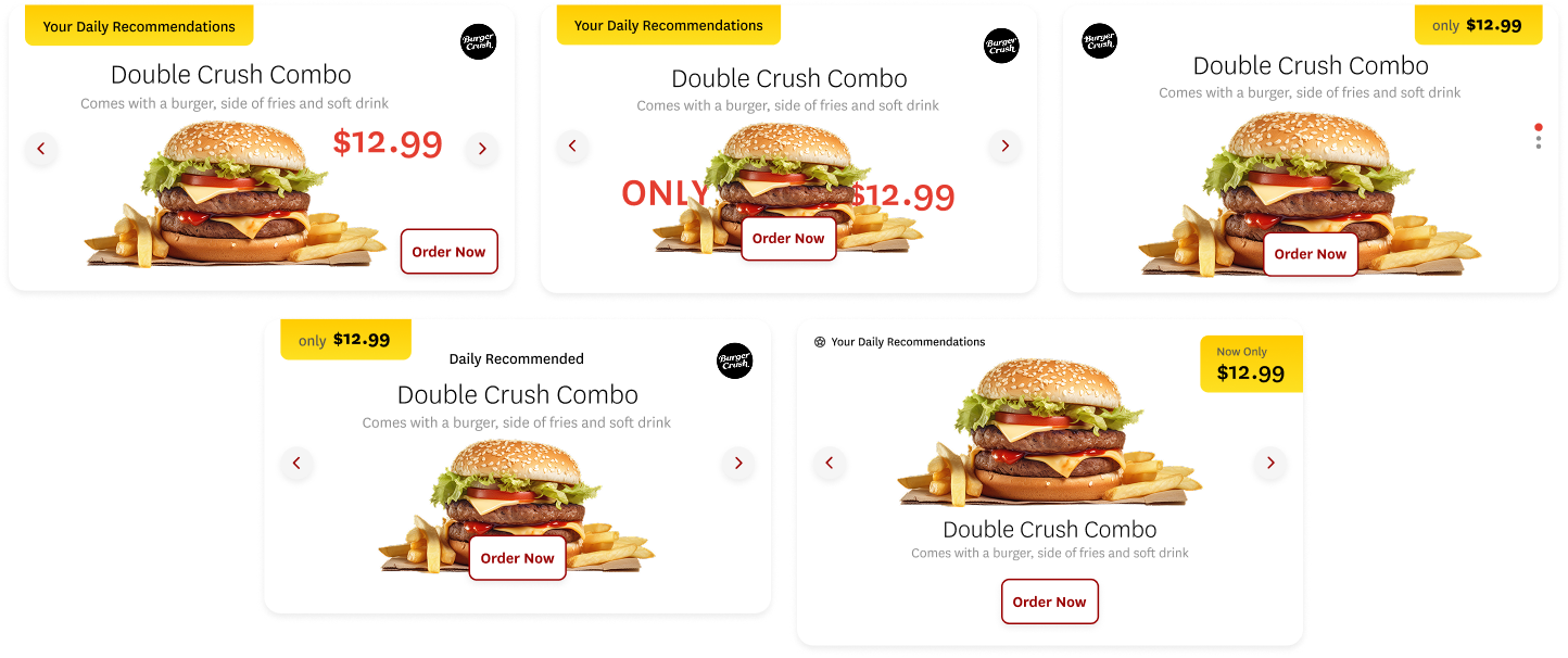
a couple iterations of the homepage recommendations tile, playing with legibility, hierarchy and CTA patterns
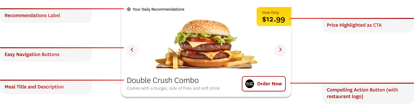
the final tile focused on successful layout and a more effect Call to action
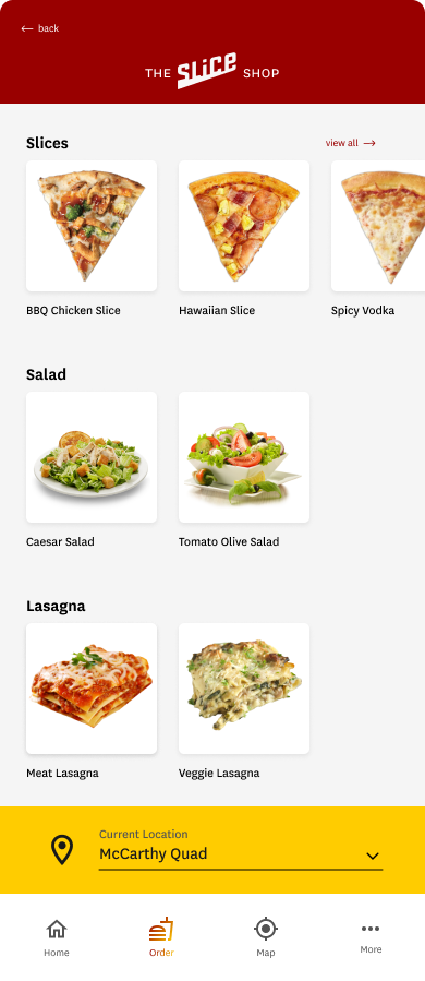
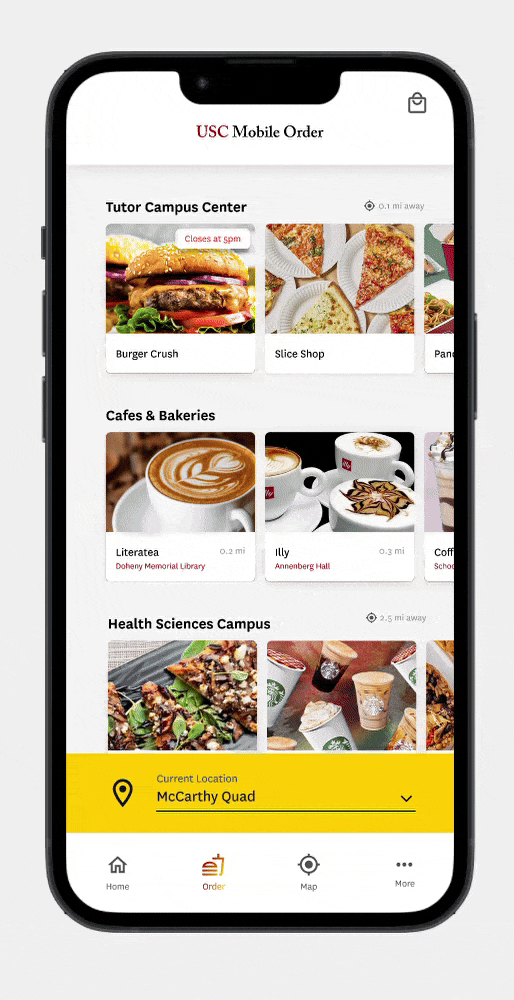
introducing
USC Mobile Order, reimagined

Intuitive ordering
This imaginative future state would allow students to envision exactly what their order would look like, before they lock it in.
Stay notified every step of the way
Students are now able to see exactly how long it will take to get their order with numerous cues, demystifying the process.
Tailored to the student experience
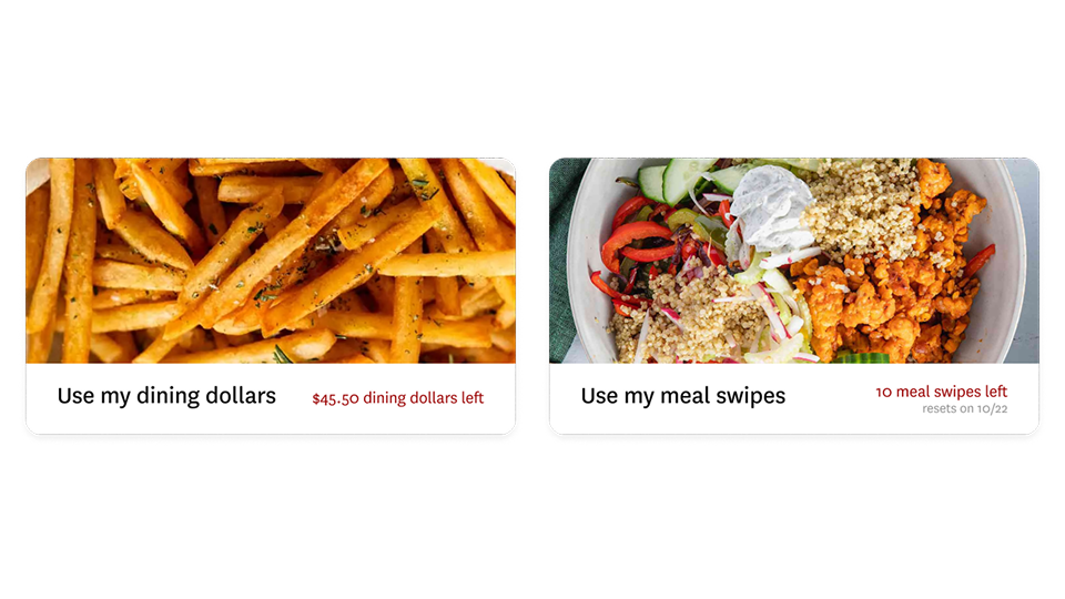
Students choose ahead of time what payment method they prefer, matching the way interviewees described thinking about the order process.


IMPACT & Reflections
My app halved the amount of time it took a student to order and reduced the error rate in completing an order by 10%
By comparing usability testing results after my redesign to data from the current app, I found an increase in the efficiency and task success rate.
My usability tests involved asking users to complete tasks like ordering a particular item, or trying to reorder their most commonly eaten meal.
Learn about my experience

I learned to be adaptable, data-driven, and spatially aware in my design
Speed
Since this was a sprint, I had to be willing to deprioritize features and think creatively within constraints. As they say in writing, you must be ready to murder your darlings (scrap your ideas)!
Empathy & Research
I put myself in the user's shoes: what was their daily set of anxieties, lifestyle, ecosystem of food ordering apps? Returning the research (and later, usability testing) was imperative to getting a full picture.
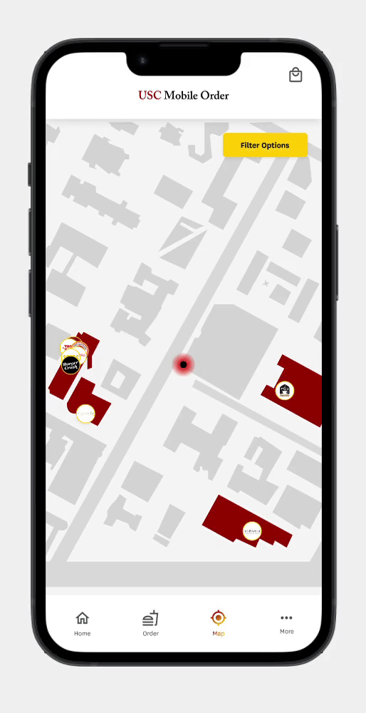
Spatially Aware
This project included challenges in addressing the geo-location aspect of ordering on a college campus. I had to understand the physical aspect of the process by understanding how the app functioned in context.