Enter password to view case study
CHASE REWARDS
2024-25

At Chase, some of my projects included working on the rewards mobile gift card flow and refining the navigation of this space. These two shorter snapshots of my time at Chase are shared here.
Role
Product designer
Timeline
1 year
Team
Senior designers, PMs, engineers, content designers, marketers
SHORT VIDEO
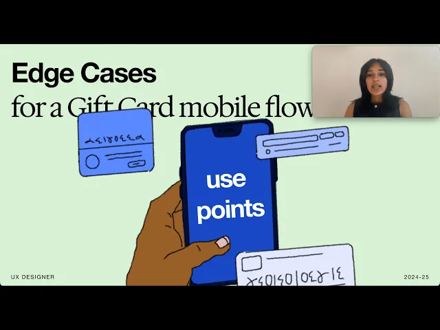
Edge case mapping
Problem
How can I approach edge case mapping to make the process more efficient, and how can I address each unique case?
Outcome
My eventual system and approach helped clarify 40+ use cases (within the complex space of a new gift card native mobile flow) and quickly align the team!
DESIGN PROCESS
Maintaining good file hygiene was imperative
I made sure that my files were easy to navigate for content writers, engineers, PMs, and future designers
Throughout the process of designing, speccing my files, and dev handoff, I relied on our extensive component library and design system guidance as well as good organizational practicies.


FIG 1.1
SWIPE TO SEE HOW I ORGANIZED MY FILES, SPECS, AND COMPONENTS
SNAPSHOT STUDY
Streamlining Navigation
Problem
How can we redesign Chase Rewards navigation to address extensive user pain points with the current process?
Outcome
Our audit and design resulted in 3 major uplifts that reduced navigation-related customer complaints by 20%!

FIG 2.1
A TYPICAL USER'S JOURNEY THROUGH THE CHASE REWARDS SPACE IS FRUSTRATING
PRODUCT FOUNDATIONS
Most users find Chase Rewards clunky, cumbersome, and hard to access
Before designing, I wanted to understand why
The biggest complication I discovered was the mobile hybrid view which was a confusing mishmash of web and mobile native views.

FIG 2.2
HYBRID IS A MISHMASH OF NATIVE AND WEB XS NAVIGATION
From there, I captured all existing screens, designed an ideal navigational view for each, and simulated via prototyping
For ever screen, I would capture web, web xs, mobile native or hybrid, and then formulate an ideal view. Then, I would prototype the navigational flow to assess issues and iteratively refine.


FIG 2.3
AN EXAMPLE OF THE IDEAL DEALS PAGE NAVIGATION (SWIPE TO SEE THE PROTOTYPING PROCESS)
DESIGN PROCESS
Through meetings with engineering and PMs, I made a few key uplifts
1
I suppressed the navigation pill that was great on web but stifled mobile hybrid
This was a pill that pingponged users between flows, and a holdover from the web version of the experience.


FIG 3.1
SUPPRESSING THE PILL (SWIPE TO SEE THE EFFECT ON OVERALL NAVIGATION)
2
I worked with our design system team to align to their guidance
This meant following conventions on the presence of certain navigation elements (‘back’ and ‘cancel’) while understanding the complexity unique to Rewards.

FIG 3.2
THE THREE PARTS OF THE PROCESS
3
I adapted naming conventions for screens with the content team
This meant each screen correctly reflected where it was in the process instead of being generic.

FIG 3.3
ADJUSTING NAMING CONVENTIONS TO BE CONTEXT-SPECIFIC


2026 | MADE POSSIBLE BY FRANTIC TEXTS TO FRIENDS, 3AM TINKERING, AND HORIZON CHOCOLATE MILK